Dash Python Library
18 June 2024
The DashIO Python library is available on GitHub.
Device
A Device is a collection of Controls and DeviceViews that represent an IoT device. The Device provides attributes and methods to communicate to a Dash app.
Device Attributes
- device_type : str. The type of device (e.g. TempSensor, GPS...). If you have lots of devices that do the same thing keep this constant across your devices.
- device_id : str. A unique identifier for this particular device.
- device_name : str. The name for this device (e.g. GlassHouse, MothersZimmerFrame...).
- cfg_dict : dict. Setup dict to setup and cfgRev, defaults None. See Helper Functions for tools to use the C64 txt generated by exporting a layout from the Dash app.
Device Methods
- addcontrol(iotcontrol). Add a control to the device.
- getcontrol(controltype, control_id). Returns control loaded into the device.
- removecontrol(controltype, control_id). Removes the control from the device.
- iscontrolloaded(iot_control). Returns boolean if the control is loaded in the device.
- use_cfg64(). Generate a C64 formated CFG message.
- use_cfg(). Generate JSON formated CFG messages.
- close(). Close the device.
Device Callback Methods
These callbacks are used to setup and configure connections by the Dash app. Setting these callbacks advertises to the Dash app that the connection can be modified.
- setwificallback(callback): Set a callback function that is called when the Dash app provides wifi provisioning information. The callback must return a Boolean indicating success.
- unsetwificallback(): Clears the wifi callback.
- setdashiocallback(callback): Set a callback function that is called when the Dash app provides Dash server provisioning information.
- unsetdashiocallback(): Clears the set Dash callback.
- setnamecallback(callback): Set a callback function that is called when the Dash app provides Name provisioning information.
- unsetnamecallback(): Clears the set Name callback.
- settcpcallback(callback): Set a callback function that is called when the Dash app provides TCP provisioning information.
- unsettcpcallback(): Clears the set TCP callback.
- setmqttcallback(callback): Set a callback function that is called when the Dash app provides MQTT provisioning information.
- unsetmqttcallback(): Clears the set MQTT callback.
Connections
To enable a device to communicate to the Dash app a connection is required. A device can have multiple connections and a connection can have multiple devices.
DashConnection
The DashConnection sets up a connection to the Dash app via the Dash mqtt server. The Dash server has support for:
- sending notifications
- data storage for TimeGraphs, EventLogs, and Maps.
- Sharing devices with other users.
DashConnection Attributes
- username : str username for the dash server connection.
- password : str password for the dash server connection.
- host : str, optional. The server name of the dash server host. Optional defaults to "dash.dashio.io"
- port :int, optional. Port number to connect to. Defaults to 8883,
- use_ssl : bool, optional. Whether to use ssl for the connection or not. default: True.
DashConnection Methods
- add_device(device: Device). Adds a device to the connection.
- close(). Closes the connection.
- set_connection(username: str, password) Changes the connection to the DashIO server.
- username : str. username for the server.
- password : str. password for the server.
TCPConnection
The TCPConnection sets up a connection to the Dash app within a local area network.
TCPConnection Attributes
- ip_address : str, optional. IP Address to use. Defaults to "*". Only set this if you know which IP address to connect to on the local machine. The "*" option will use all available addresses.
- port : int, optional. Port to use. Defaults to 5650.
- usezeroconf : bool, optional. Use mDNS to advertise the connection. Defaults to True. This allows the Dash app to find the connection on the network.
TCPConnection Methods
- add_device(device: Device). Adds a device to the connection.
- close(). Closes the connection.
BLEConnection
The BLEConnection is only supported on Linux systems and requires bluez and dbus to be installed. It has been developed with the RaspberryPi in mind.
BLEConnection Attributes
- ble_uuid : str, optional. The UUID used by the BLE connection, if None a UUID is generated.
BLEConnection Methods
- add_device(device: Device). Adds a device to the connection.
- close(). Closes the connection.
The steps to get a Pi Zero to become a Device Server
Install bluez and bluetooth:
sudo apt-get install bluetooth bluezEdit:
sudo nano /lib/systemd/system/bluetooth.serviceReplace:
ExecStart=/usr/lib/bluetooth/bluetoothd
With:
ExecStart=/usr/lib/bluetooth/bluetoothd --noplugin=sapEdit:
sudo nano /lib/systemd/system/bthelper@.serviceReplace the [Service] segment with:
[Service]
Type=simple
ExecStartPre=/bin/sleep 2
ExecStart=/usr/bin/bthelper %I
ExecStartPost=sudo /etc/init.d/bluetooth restart
Edit:
sudo nano /etc/bluetooth/input.conf Set:
LEAutoSecurity=falseTo use the BLEConnection it has to be imported explicitly:
from dashio.bleconnection import BLEConnectionControls
Controls are objects that represent actions and widgets in the Dash application. All controls have a ControlID, Title, and TitlePosition. The ControlID should be a string that can uniquely identifiy that control per device. The control Title is text that is displayed on the Dash app with the Contol. The TitlePosition can be either TitlePosition.TOP, TitlePosition. TOPLEFT, TitlePosition.BOTTOM, or TitlePosition.NONE. Controls that are displayed have a dashio.ControlPosition that is composed of four size and position variables: xpositionratio, ypositionratio, widthratio, heightratio. The first two are position ratios that place the top left corner of the widget on the DeviceView. The last two are ratios that govern the size of the widget. The ratios are propertional to the size of the screen with the full size of the screen representing 1.0. All controls have a callback that is used to return messages from the Dash app. Controls on the Dash app can have a graphical duplicate that may have a different set of Config attributes. This is achieved by adding that controls ControlControl with addconfigcolumnar(ControlControl).
Controls have two main types of attributes.
1) Config Attributes. These attributes define the look and placement of the control. They are used to generate the config information sent to the Dash app when it issues a CFG command to the device, these are set in init.
2) Messaging Atttributes. Setting these attributes send messages to the Dash app controlling the visable appearance of the control.
When controls are instantiated they create a ControlControl to add to its layout. More layouts can be added by creating a ControlConfig for that control and adding it with addconfigcolumnar(ControlConfig) or addconfigfullpage(ControlConfig). This allows you to have two layouts - a columnar layout for phones and another for tablets. If you use a addconfigfullpage layout then you will need to set the number of columns it uses with setnoculumnsfullpage().
DeviceView
A DeviceView provides a control that descibes appearance and style of the group of controls that are displayed on this DeviceView by the iotdashboard app.
DeviceView Attributes
All of these attributes are config attributes.
- control_id : str. An unique control identity string. The control identity string must be a unique string for each control per device. Each control inherits the DeviceViews Control settings.
- title : str. The controls title.
- style : DeviceViewStyle. The style of the DeviceView.
- icon : Icon. The Icon representing the DeviceView.
- color : Color. The color of the DeviceView.
- share_column : Booloan. If there is space can another DeviceView us it.
- num_columns : int. Number of columns for DeviceView.
- controltitlebox_color : Color. Title box color for controls.
- controltitlebox_transparency : int. Title box transparency for controls.
- numgridcolumns : int. The num of grid columns on the edit view.
- numgridrows : int. The num of grid rows on the edit view.
DeviceView Methods
- add_control(Control) : Add a control to the device view
- fromcfgdict(Dict) : Instantiate a DeviceView as defined from the dictionary. See Helper Functions for tools to use the C64 txt generated by exporting a layout from the Dash app.
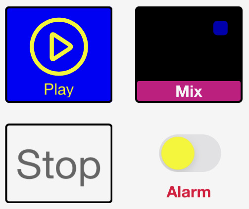
Alarm
alarm = dashio.Alarm("alarm1_ID")
alarm.send("Alarm Header", "Alarm Body")
An alarm sends a notification throught the dashio mqtt server to registered phones. The ability to send alarms to specific phones, and the notification sound can be configured through the Dash app. Alarms are only available if you have an account registered on the Dash server and you send the the alarm through a dash connection.
Alarm Config Attributes
- control_id : str. An unique control identity string. The control identity string must be a unique string for each control per device
Alarm Methods
- send(self, header: str, body: str). Sends an alarm with header and body.
Audio Visual Display
An Audio Visual display allows the IoT Device to send a URL to the Dash app to play or display the contents of the URL. The URL may be a video or audio stream or an image.

Audio Visual Display Config Attributes
- control_id : str. An unique control identity string. The control identity string must be a unique string for each control per device
- title : str, optional. Title of the control, by default None
- control_position : ControlPosition, optional. The position of the control on a DeviceView, by default None
- title_position : TitlePosition, optional. Position of the title when displayed on the iotdashboard app, by default None
Audio Visual Display Message Attributes
- url : str. The url of the media to play.
Button
A Button allow the user to send a simple action, informing the IoT device that the button has been pressed. The button state (on or off color) is not changed by tapping the button. After the IoT device receives a message containing the action, it sends a message back to the control in the dashboard to set the button state.
A Button control behaves as both as a momentary push button for user input and as a status indicator to provide feedback from the IoT device.
The control can change the button icon and text of the control on the Dash app.
button1 = Button("button1_id", "Button Title")
button1.state = ButtonState.ON
button1.send_button(ButtonState.ON, Icon.UP, "Going Up")
button1.send_button(ButtonState.OFF, Icon.DOWN, "Going Down")
Button Config Attributes
- control_id : str. A unique identity string. The identity string must be a unique string for each ButtonGroup per device.
- title : str. A short title for the button group.
- title_position : TitlePosition. Can be TitlePosition.BOTTOM, TitlePosition.TOP, TitlePosition.OFF.
- button_enabled : boolean. True allows the app to send button events. False disables button pushes.
- style : ButtonStyle. Can be ButtonStyle.BASIC, ButtonStyle.HIGHLIGHT.
- off_color : Color. Set the off color.
- on_color : Color. Set the on color.
- control_position : ControlPosition. Set the size and position of the button on a DeviceView.
Button Messaging Attributes
When these attributes are set the button control will transmit the new value to connected Dash apps.
- text : str. The text that appears on the ButtonGroup.
- icon_name : Icon. Set the icon for the button.
- btn_state : ButtonState. Set the state of the button.
Button Methods
- sendbutton(btnstate: ButtonState, btn_icon: Icon, text: str) : Updates the button state, button icon and text
- fromcfgdict(cfg_dict: dict): Instantiate a Button as defined from the dictionary. See Helper Functions for tools to use the C64 txt generated by exporting a layout from the Dash app.
Button Callbacks
- addreceivemessage_callback(callback): Add callback to handle the message from the Dash app. The callback recieves a list formed by splitting the message from the Dash app on the tab character.
Button Group
A ButtonGroup control is used to present a popup grid or table of Button controls. The Button Group does not receive or send messages directly, but presents Button controls that send and receive messages.
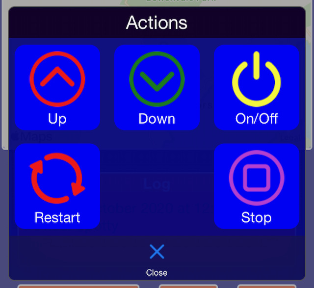
Button Group Config Attributes
- control_id : str. A unique identity string. The identity string must be a unique string for each ButtonGroup per device
- title: str. A short title for the button group
- style : ButtonGroupStyle. Can be ButtonGroupStyle.BASIC, ButtonGroupStyle.HIGHLIGHT.
- text : str. The text that appears on the ButtonGroup
- control_position : ControlPosition, optional. The position of the control on a DeviceView, by default None.
- title_position : TitlePosition, optional. Position of the title when displayed on the iotdashboard app, by default None
- icon : Icon. Set the icon for the button.
- grid_view : Bool. Defaults to True.
Button Group Methods
- add_button(Button): Add a button to the ButtonGroup
- fromcfgdict(cls, cfg_dict: dict): Instantiate a ButtonGroup as defined from the dictionary. See Helper Functions for tools to use the C64 txt generated by exporting a layout from the Dash app.
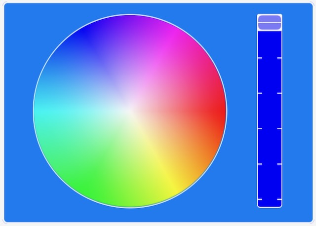
Color Picker
A ColorPicker control is used to select a colour to send to the IoT device. The Colour Picker may be shown as either a spectrum or as a colour wheel and brightness slider.
Color Picker Config Attributes
- control_id : str. An unique control identity string. The control identity string must be a unique string for each control per device.
- title : str, optional. Title of the control, by default None.
- control_position : ControlPosition, optional. The position of the control on a DeviceView, by default None.
- title_position : TitlePosition, optional. Position of the title when displayed on the iotdashboard app, by default None
- picker_style: ColorPickerStyle, optional. The style of color picker to use.
- sendonlyon_release: Boolean. Send only on release, by default True
Color Picker Message Attributes
- color_value : str. Send the color. The color_value must be in #rrggbb format.
Color Picker Methods
- sendcolorrgb(red: int, green: int, blue: int). Format the red, green, blue values as #RRGGBB and send to any connected Dash apps.
- colortorgb(color_value: str). Return a tuple of RED, GREEN, BLUE integers from the given string in #RRGGBB format.
- fromcfgdict(cls, cfg_dict: dict): Instantiate a ColorPicker as defined from the dictionary. See Helper Functions for tools to use the C64 txt generated by exporting a layout from the Dash app.
Color Picker Callbacks
- addreceivemessage_callback(callback): Add callback to handle the message from the Dash app. The callback recieves a list formed by splitting the message from the Dash app on the tab character.
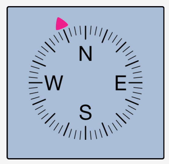
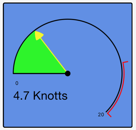
Direction
A Direction display is used to graphically present a decimal direction value from 0 to 360 degrees. The Direction display receives messages from the IoT device to set the direction indicator position.
Direction Config Attributes
- control_id : str. An unique control identity string. The control identity string must be a unique string for each control per device.
- title : str, optional. Title of the control, by default "A Control".
- control_position : ControlPosition, optional The position of the control on a DeviceView, by default None
- title_position : TitlePosition, optional. Position of the title when displayed on the iotdashboard app, by default None.
- \style : DirectionStyle, optional. The Direction style to display, by default DirectionStyle.DEG.
- pointer_color : Color, optional. Color of the pointer, by default Color.GREEN.
- units : str, optional. Units to be displayed with the value, by default "".
- precision : [type], optional. Precision of the value displayed, by default Precision.OFF
- calibration_angle : int, optional Calibration angle offset, by default 0.
Direction Message Attributes
- direction_value : float. The direction to send to the Dash app.
- direction_text : str. Text to be displayed on the direction control.
Direction Methods
- fromcfgdict(cls, cfg_dict: dict): Instantiate a Direction as defined from the dictionary. See Helper Functions for tools to use the C64 txt generated by exporting a layout from the Dash app.
Direction Callbacks
- addreceivemessage_callback(callback): Add callback to handle the message from the Dash app. The callback recieves a list formed by splitting the message from the Dash app on the tab character.
Dial
A Dial display is used to present a numerical value in a graphical circular dial. The Dial display receives messages from the IoT device to set the dial position.
Dial Config Attributes
- control_id : str. An unique control identity string. The control identity string must be a unique string for each control per device.
- title : str, optional. Title of the control, by default None.
- control_position : ControlPosition, optional. The position of the control on a DeviceView, by default None.
- title_position : TitlePosition, optional. Position of the title when displayed on the iotdashboard app, by default None.
- dial_min : float, optional. Minimum dial position, by default 0.0.
- dial_max : float, optional. Maximum dial position, by default 100.0.
- red_value : float, optional. Position for red part of dial, by default 75.0.
- dialfillcolor : Color, optional. Dial fill color, by default Color.RED.
- pointer_color : Color, optional. Pointer color, by default Color.BLUE.
- number_position : DialNumberPosition, optional. Position of the number on the dial, by default DialNumberPosition.LEFT.
- showminmax : bool, optional. True to show min max, by default False.
- style : DialStyle, optional. Dial style, by default DialStyle.PIE.
- precision : Precision, optional. Precision of the displayed number, by default Precision.OFF.
- units : str, optional. Units of the dial position, by default "".
Dial Message Attributes
- dial_value : float. The value to display on a dial.
Dial Methods
- fromcfgdict(cls, cfg_dict: dict): Instantiate a Dial as defined from the dictionary. See Helper Functions for tools to use the C64 txt generated by exporting a layout from the Dash app.
Dial Callbacks
- addreceivemessage_callback(callback): Add callback to handle the message from the Dash app. The callback recieves a list formed by splitting the message from the Dash app on the tab character.
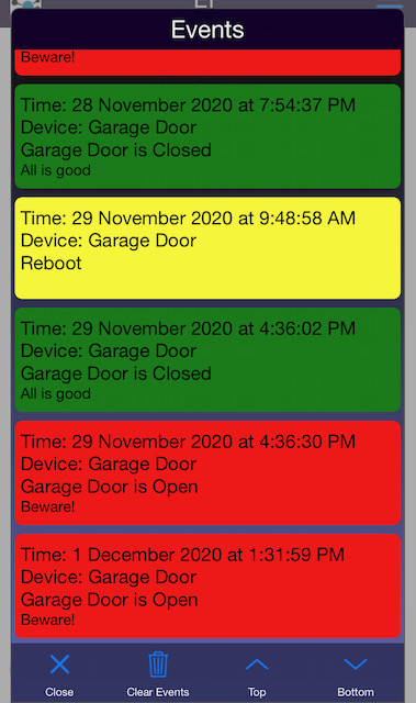
Event Log
An Event Log display is used to present time stamped events or alarms from IoT devices. The most recent event is shown on the control and a scrollable list of events is presented when the Event Log is tapped by the user.
Each event contains the time of the event, the color to display the event and the text to display.
Events are stored in the Dash app.
The dash server may be setup to continously record Event messages and the Dash app will update its EventLog from the dash server each time the app is run by the user.
Multiple IoT devices can be shown on a single Event Log control.
Event Data
An EventData object is a single event used by the EventLog.
Event Data Attributes
- lines : str. Max 25 lines long. Each line is seperated by '\n'
- color : Color, optional. The color to display this data point on the iotdashboard app, by default Color.WHITE
Event Log Config Attributes
- control_id : str. A unique identifier for this control
- title : str, optional. The title for this control will be displayed on the iotdashboard app, by default "An Event Log".
- title_position : TitlePosition, optional. The position of the title, by default TitlePosition.BOTTOM
- control_position : ControlPosition, optional. The position of the control on a DeviceView, by default None
- maxlogentries : int, optional. The EventLog usues a ring buffer for data entries this dfines the number entries before over wrting older entires, by default 100.
Event Log Methods
- addeventdata(self, data: EventData):. Add a data point to the log and send it to any connected iotdashboard app.
- send_data(self). Send the latest log entry to any connected iotdashboard app.
- fromcfgdict(cls, cfg_dict: dict): Instantiate an EventLog as defined from the dictionary. See Helper Functions for tools to use the C64 txt generated by exporting a layout from the Dash app.
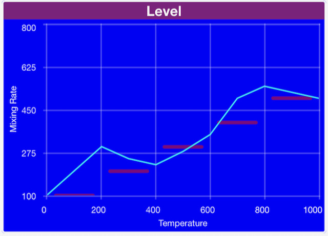
Chart
A Chart display is used to present graphical data on the DashIO Dashboard, where the data is a series of vertical (Y) axis data. The data is evenly spaced on the horizontal (X) axis. The IoT device sends a message for each line in the Chart. The data may be shown as lines, bars or peak values.
Each line can be independently added, deleted or changed by the IoT device. Multiple IoT devices can add lines to a single Chart control.
import dashio
chart = dashio.Chart("chart1", "Chart")
cl_line = dashio.ChartLine("Randon Data", dashio.ChartLineType.LINE, color=dashio.Color.BLUE, right_axis=false)
data = np.random.normal(0, 20, 100)
cl_line.data = data.tolist()
chart.add_line("line_1", cl_line)
Chart Line
An GraphLine object represents a line for a Chart.
Chart Line Attributes
- name : str. The name of the line.
- line_type : ChartLineType. The format of the line: LINE, BAR, SEGBAR, PEAKBAR, DEL. Sending DEL removes the line from the chart.
- color : Color, optional. The color of the ChartLine. Default Color.BLACK.
- right_axis : bool, optional. If True use the right axis of graph. Default False
- data. : list. The list containing data values to display on the Chart.
Chart Config Attributes
- control_id : str. A unique identifier for this control.
- title : str, optional. The title for this control will be displayed on the iotdashboard app, by default "A Chart".
- title_position : TitlePosition, optional. The position of the title, by default TitlePosition.BOTTOM.
- xaxislabel : str, optional. The label for the X axis, by default "".
- xaxismin : float, optional. Min value for the X axis, by default 0.0.
- xaxismax : float, optional. Max value for the X axis, by default 100.0.
- xaxisnum_bars : int, optional. Number of bars on the X axis, by default 5.
- xaxislabels_style : ChartXAxisLabelsStyle, optional. The style for the X axis, by default ChartXAxisLabelsStyle.ON.
- yaxislabel : str, optional. The label for the Y axis,, by default "".
- yaxismin : float, optional. Min value for the Y axis, by default 0.0.
- yaxismax : float, optional. Max value for the Y axis, by default 1000.0.
- yaxisnum_bars : int, optional. Number of bars on the Y axis, by default 5.
- yaxislabel_rt : str, optional. Label for the Y axis right side, by default ''.
- yaxismin_rt : float, optional. Min value for the right Y axis, by default 0.0.
- yaxismax_rt : float, optional. Max value for the right Y axis, by default 1000.0.
- control_position : ControlPosition, optional. The position of the control on a DeviceView, by default None.
Chart Methods
- addline(self, lineid: str, cline: ChartLine). Add a line to the Chart.
- line_id: str. An unique identifier for this line on the Chart.
- cline: ChartLine. The Line to add to the Chart.
- send_chart(). Sends the Chart data to IoT dashboard.
- fromcfgdict(cls, cfg_dict: dict): Instantiate an EventLog as defined from the dictionary. See Helper Functions for tools to use the C64 txt generated by exporting a layout from the Dash app.
Knob
A Knob allow the user to send numerical values to the IoT device when the user drags the knob to a new position. A Knob control contains a user adjustable knob surrounded by a simple dial indicator. The dial can be controlled independently of the knob or can be used to provide feedback to the user from the IoT Device.
The IoT device may send messages to update both the dial and knob positions.
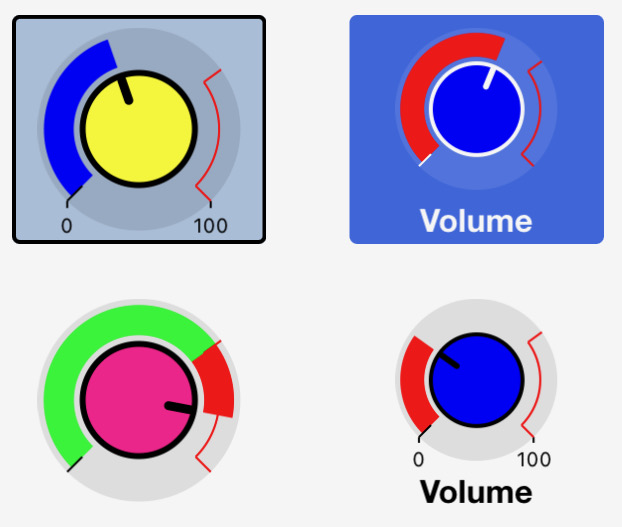
Knob Config Attributes
- control_id : str. A unique identifier for this control.
- title : str, optional. The title for this control will be displayed on the iotdashboard app, by default "A Knob".
- title_position : TitlePosition, optional. The position of the title, by default TitlePosition.BOTTOM.
- knob_style : KnobStyle, optional. The Knob style, by default KnobStyle.NORMAL.
- dial_min : float, optional. Minimum dial value, by default 0.0.
- dial_max : float, optional. Maximum dial value, by default 100.0.
- red_value : float, optional. The value where the red starts, by default 75.0.
- showminmax : bool, optional. Whether to show the min amd max values, by default False.
- sendonlyon_release : bool, optional. Have the Dash app send values either on release or during movement, by default True.
- DEPRECATED dialfollowsknob : bool, optional. Have the Dash app adjust the dial to match the knob value, by default False.
- dialMode : DialMode, optional default DialMode.FOLLOW. Have the DashIO app adjust the dial to match the knob value, by default DialMode.FOLLOW. DialMode.MSG mode makes the Dial controlled by messages.
- dial_color : Color, optional. Color of the Dial, by default Color.BLUE.
- knob_color : Color, optional. Color of the Knob, by default Color.RED.
- control_position : ControlPosition, optional. The position of the control on a DeviceView, by default None.
Knob Message Attributes
- knob_value : float. Sends the value of the knob.
- knobdialvalue : float. Sends the value for the dial on the knob.
Knob Methods
- fromcfgdict(cls, cfg_dict: dict): Instantiate a Knob as defined from the dictionary. See Helper Functions for tools to use the C64 txt generated by exporting a layout from the Dash app.
Knob Callbacks
- addreceivemessage_callback(callback): Add callback to handle the message from the Dash app. The callback recieves a list formed by splitting the message from the Dash app on the tab character.
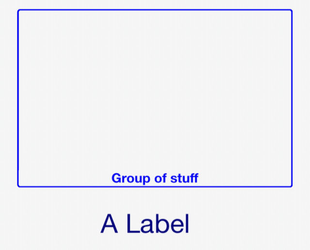
Label
A Label is a simple control to add structure to your layout on the dashboard. Labels do not transfer information with IoT devices.
Label Config Attributes
- control_id : str. An unique control identity string. The control identity string must be a unique string for each control per device.
- title : str, optional. Title of the control, by default "A Label".
- control_position : ControlPosition, optional. The position of the control on a DeviceView, by default None
- title_position : TitlePosition, optional. Position of the title when displayed on the iotdashboard app, by default None.
- color : Color, optional. Color of the label, by default Color.WHITE.
- style : LabelStyle, optional. Style of label to be displayed, by default LabelStyle.BASIC
Label Methods
- fromcfgdict(cls, cfg_dict: dict): Instantiate a Label as defined from the dictionary. See Helper Functions for tools to use the C64 txt generated by exporting a layout from the Dash app.
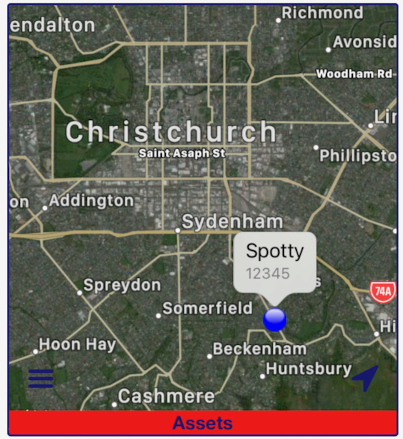
Map
A Map display is used to plot positions on a map. The Map display receives messages from the IoT Device that contain latitude and longitude to mark the position. Additional data, such as speed and altitude may also be included and shown on the Map display.
Multiple IoT devices can be shown on a single Map.
Menu
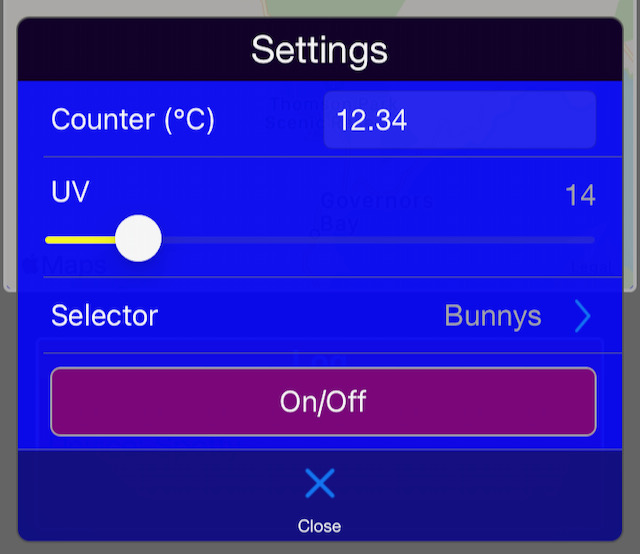
A Menu control is used to present a popup table of user adjustable controls and is ideal for presenting a list of IoT device setup parameters. The Menu does not receive messages directly, but presents a list of other controls (sub-controls) that send and receive messages of their own.
Controls that can be included in a Menu control are Text Boxes, Sliders, Selectors and Buttons.
Menu Config Attributes
- control_id : str. An unique control identity string. The control identity string must be a unique string for each control per device.
- title : str, optional. Title of the control, by default "A Menu"
- control_position : ControlPosition, optional. The position of the control on a DeviceView, by default None.
- title_position : TitlePosition, optional. Position of the title when displayed on the iotdashboard app, by default None.
- style : ButtonStyle. Can be ButtonStyle.BASIC, ButtonStyle.HIGHLIGHT.
- text : str, optional. Menu text, by default "A Menu with Text".
- icon : Icon, optional. Menu icon, by default Icon.MENU.
Menu Methods
- add_control(control). Add a control to the menu.
- fromcfgdict(cls, cfg_dict: dict): Instantiate a Menu as defined from the dictionary. See Helper Functions for tools to use the C64 txt generated by exporting a layout from the Dash app.
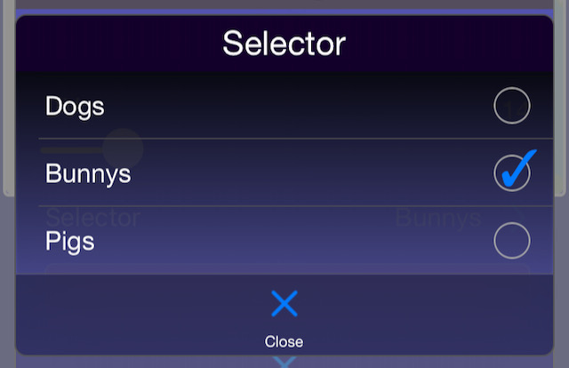
Selector
A Selector control is used to present a popup list of options that the user can select from. When a Selector is tapped, the DashIO Dashboard presents the list of text options to the user to make their selection from. The user can tap on an option to select is and the index of the selected option will be sent to the IoT device.
Feedback to the user of the dashboard is achieved when the IoT device responds to the selection message. The dashboard updates the Selector control check box with this value.
Selector Config Attributes
- control_id : str. An unique control identity string. The control identity string must be a unique string for each control per device.
- title : str, optional. Title of the control, by default "A Selector".
- control_position : ControlPosition, optional. The position of the control on a DeviceView, by default None.
- title_position : TitlePosition, optional. Position of the title when displayed on the iotdashboard app, by default None.
Selector Message Attributes
- position : int. Sends the position index of the selected Text.
Selector Methods
- add_selection(text: str):. Add the text to the selection list.
- setselected(selectedtext: str). Set the selector to the selected text
- fromcfgdict(cls, cfg_dict: dict): Instantiate a Menu as defined from the dictionary. See Helper Functions for tools to use the C64 txt generated by exporting a layout from the Dash app.
Selector Callbacks
- addreceivemessage_callback(callback): Add callback to handle the message from the Dash app. The callback recieves a list formed by splitting the message from the Dash app on the tab character.
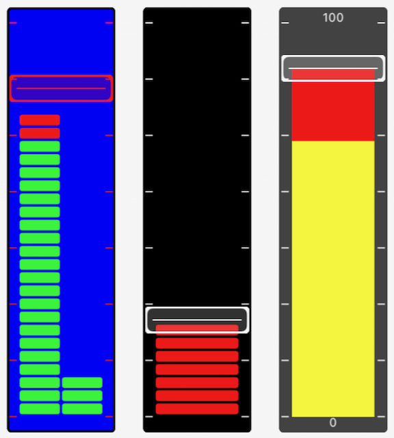
Slider
A Sliders allow the user to send a numerical values to the IoT device when the user drags the slider to a new position. The slider also includes a bar graph that can be set by the IoT device. The bar graphs can be controlled independently of the slider or can be used to provide feedback to the user from the IoT Device.
The IoT device may send messages to update both the bar graph and the slider knob positions. The bar graph may set to have two bars.
The knob of the slider may be disabled so that the slider becomes a simple bar graph indicator.
Slider Config Attributes
- control_id : str. An unique control identity string. The control identity string must be a unique string for each control per device.
- title : str, optional. Title of the control, by default "A Single SLider".
- control_position : ControlPosition, optional. The position of the control on a DeviceView, by default None
- title_position : TitlePosition, optional. Position of the title when displayed on the iotdashboard app, by default None.
- bar_min : float, optional. The min bar value, by default 0.0.
- bar_max : float, optional. The max bar vale, by default 1000.0
- red_value : int, optional. Bar red value, by default 750
- showminmax : bool, optional. show min max, by default False.
- slider_enabled : bool, optional. Enable slider, by default True.
- sendonlyon_release : bool, optional. Send only on release, by default True.
- DEPRECATED barfollowsslider : bool, optional. Whether the bar follows slider, by default False.
- barMode : BarMode, optional default BarMode.FOLLOW. Whether the bar follows slider, by default BarMode.FOLLOW. BarMode.MSG mode makes the bar controlled by messages.
- bar_color : Color, optional. The bar color, by default Color.BLUE.
- knob_color : Color, optional. The knob color, by default Color.RED.
- bar_style : SliderBarStyle, optional. The bar style, by default SliderBarStyle.SEGMENTED
Slider Message Attributes
- bar1_value : float. Sends the value of bar1.
- bar2_value : float. Sends the value of bar2. If this value is not set then only one bar is shown on the Dash app.
- slider_value : float.* Sends the slider value.
Slider Methods
- fromcfgdict(cls, cfg_dict: dict): Instantiate a Slider as defined from the dictionary. See Helper Functions for tools to use the C64 txt generated by exporting a layout from the Dash app.
Slider Callbacks
- addreceivemessage_callback(callback): Add callback to handle the message from the Dash app. The callback recieves a list formed by splitting the message from the Dash app on the tab character.
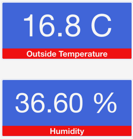
Text Box
A Text Box control receives simple line text messages from the IoT device to display on the DashIO Dashboard. The text may optionally be plain text, reformatted as a number or, when the text is ISO8601 date/time, it may be formatted to a date/time that is easy to read.
The Text Box may also allow the user to input text. Touching the control will present the user with a keyboard where the user can enter text. When the Send button on the keyboard is pressed, the message will be sent to the IoT device.
Text Box Config Attributes
- control_id : str. An unique control identity string. The control identity string must be a unique string for each control per device.
- title : str, optional. Title of the control, by default None.
- control_position : ControlPosition, optional. The position of the control on a DeviceView, by default None.
- title_position : TitlePosition, optional. Position of the title when displayed on the iotdashboard app, by default None.
- text : str, optional. Text for the textbox, by default "".
- text_align : TextAlignment, optional. Text alaignment, by default TextAlignment.LEFT.
- text_format : TextFormat, optional. Format of the text, by default TextFormat.NONE.
- units : str, optional. Units, by default "".
- precision : Precision, optional. precision, by default Precision.OFF
- keyboard_type : Keyboard, optional. Keyboard type for the textbox, by default Keyboard.ALL.
- closekeyboardon_send : bool, optional. Set to True to close keyboard on close, by default True.
- caption_mode : CaptionMode, optional. default CaptionMode.MSG. CaptionMode.MSG is for when the caption receives messages to be displayed. CaptionMode.SENT is when the caption shows the last message the user has entered.
Text Box Message Attributes
- text : str. Sends text to the Dash app.
- color : Color. The text color, by default Color.WHITE.
- caption_text : str. Sends caption text to the Dash app.
- caption_color : Color. The caption text color, by default Color.WHITE.
Text Box Methods
- fromcfgdict(cls, cfg_dict: dict): Instantiate a Menu as defined from the dictionary. See Helper Functions for tools to use the C64 txt generated by exporting a layout from the Dash app.
Text Box Callbacks
- addreceivemessage_callback(callback): Add callback to handle the message from the Dash app. The callback recieves a list formed by splitting the message from the Dash app on the tab character.
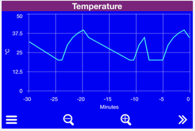
Time Graph
A Time Graph display is used to present time-series graphical data on the DashIO Dashboard, where the data is a series of points containing the time on the horizontal axis and other data on the vertical axis. The IoT device sends messages for each line in the graph. Each message contains one or more data points and the DashIO Dashboard appends the incoming data to create a data series that can be presented, panned and zoomed by the user. The data may be shown as lines, bars or blocked areas.
Each line can be independently added, deleted or changed by the IoT device. Multiple IoT devices can add lines to a single Time Graph control.
Graph data is stored in the Dash app.
The dash server may be setup to continously record TimeGraph messages and the Dash app will update its TimeGraph from the dash server each time the app is run by the user.
Data Point
A DataPoint is a time stamped data point for a Time Graph Line.
Data Point Attributes
- data. A data point can be an int, float, or boolean, or string representing a number. The time that the DataPoint is made is recorded with the data point.
Time Graph Line
A TimeGraphLine for a TimeGraph control.
Time Graph Line Attributes
- name : str, optional. The name of the line, by default "".
- line_type : TimeGraphLineType, optional. Which line type to use, by default TimeGraphLineType.LINE.
- color : Color, optional. The color of the line, by default Color.BLACK.
- maxdatapoints : int, optional. The data is stored in a ring buffer this sets the ring buffer size, by default 60
- break_data : bool, optional. If true draws the line with breaks between missing data, by default False
- right_axis : bool, optional. If true use the right axis, by default False.
Time Graph Line Methods
- adddatapoint(data_point : DataPoint):. Adds a DataPoint to the TimeGraphLine.
Time Graph Config Attributes
- control_id : str. An unique control identity string. The control identity string must be a unique string for each control per device.
- title : str, optional. Title of the control, by default "A TimeGraph"
- control_position : ControlPosition, optional. The position of the control on a DeviceView, by default None.
- title_position : TitlePosition, optional. Position of the title when displayed on the iotdashboard app, by default None.
- yaxislabel : str, optional. Label for the Y axis, by default "Y axis".
- yaxismin : float optional. Min value for the Y axis, by default 0.0.
- yaxismax : float, optional. Max value for the Y axis, by default 1000.0.
- yaxisnum_bars : int, optional. The number of bars to display on the graph, by default 5.
- yaxislabel_rt : str, optional. Label for the Y axis right side, by default ''.
- yaxismin_rt : float, optional. Min value for the right Y axis, by default 0.0.
- yaxismax_rt : float, optional. Max value for the right Y axis, by default 1000.0.
Time Graph Methods
- addline(lineid: str, gline: TimeGraphLine). Adds a TimeGraphLine to the TimeGraph.
- line_id : str. A unique to the graph line id
- gline : TimeGraphLine. The line to add
- send_data():. Sends the latest data to the Dash app.
- fromcfgdict(cls, cfg_dict: dict): Instantiate a Menu as defined from the dictionary. See Helper Functions for tools to use the C64 txt generated by exporting a layout from the Dash app.
Helper Functions
decode_cfg64(cfg: str) -> dict:
Decodes and unzips a C64 text string generated by the Dash app when it exports a layout. Returns a dictionary.
encode_cfg64(cfg: dict) -> str:
Encodes cfg dictionary into C64 string.
get_control_from_config(control_id: str, cfg_dict: dict):
Returns a control object instantiated from cfgdict with the given controlid.
get_control_dict_from_config(control_id: str, cfg_dict: dict) -> dict:
Returns a control config dictionary from cfgdict with the given controlid
load_all_controls_from_config(device, cfg_dict)
Loads all the controls in cfg_dict into the given device.
Commandline Utilities
Also included in the library are two commandline utilities to encode and decode cfg64 files.
$ c64_decode -h
usage: c64_decode [-h] [-p] [-o OUT_FILE] [-i INDENT] file

positional arguments:
  file                  Input file name.

options:
  -h, --help            show this help message and exit
  -p, --print           Print output.
  -o OUT_FILE, --out OUT_FILE
                        output filename.
  -i INDENT, --indent INDENT
                        Indent depth (Default 4).
And
$ c64_encode -h
usage: c64_encode [-h] [-f FORMAT] [-o OUT_FILE] [-w WIDTH] file

positional arguments:
  file                  Input file name.

options:
  -h, --help            show this help message and exit
  -f FORMAT, --format FORMAT
                        Format output. Options: 'None', 'C', 'Python'.
  -o OUT_FILE, --out OUT_FILE
                        output filename.
  -w WIDTH, --width WIDTH
                        Width of formatted output (Default 80).